Steve Krug’s
first book - Don’t Make Me Think: A Common Sense Approach to Web Usability -
was an enjoyable read. The value of the
book depends largely on experience and expectations of the reader. On the back cover, the book states that it’s
for Web Design/Web Development and the User Level of Beginning-Advanced. Hence, coming in as a QA engineer/manager, I
didn’t know if my expectations were going to be met. While the book was an enjoyable read, I only
found a couple of sections that I could apply immediately to my work.
Usability
Testing
Steve does a
great job throughout the book of including images and analogies which help pull
everything together - indeed, web design in many cases is no different than any
other kind of design. All design should
be clever enough to complete the task well, but simple enough that the task
should be easily accomplished by anyone.
Chapter 9
had the greatest impact on me as a QA manager.
Chapter 9 is all about usability testing. Steve said a few interesting things about
usability. Among my favorites was on pg.
132: “…the main thing (usability testing) ends up doing is revealing that the
things they were arguing about aren’t all that important. People often test to decide which color
drapes are best, only to learn that they forgot to put windows in the room. For instance, they might discover that it
doesn’t make much difference whether you go with the horizontal navigation bar
or the vertical menus if nobody understands the value proposition of your site. Sadly, this is how much usability testing
gets done: too little, too late, and for all the wrong reasons.”
 He also
distinguished between a Focus Group - a small group of people that sit around a
table and react to ideas and designs that are shown to them and determine
whether ideas and value proposition are good - and Usability Testing - one user
at a time being shown something and asked to figure out what it is or to try to
use it to do a required task. The
usability tests identify whether the implementation of ideas and value
proposition work correctly.
Usability
testing is important as “after you’ve worked on a site for even a few weeks,
you can’t see it freshly anymore. You
know too much. The only way to find out
if it really works is to test it (via usability testing).” pg. 133
As quality
assurance managers or engineers, I think we need to push up our testing of
usability earlier in the game. A lot of
times this should happen with the web designer or a usability expert, but I
believe that having QA involved early can have a very positive impact as we
implement critical thinking skills against the results of the usability test
results.
Goodwill
Steve also
talks a lot about goodwill when it comes to website usability. As internet users, we have varying degrees of
goodwill that can be expended. As errors
occur, information is lost or difficult to find or the website is not
accessible, our goodwill takes a hit.
I hate to
say it, but I feel like Steve’s book took a hit against my goodwill. At the same time, there were enough things
that boosted my goodwill that made up for the negatives.
Goodwill
+ The book has great design and
applicable examples. Steve gave a very
clear idea on how to implement his ideas right away. The graphics were fun and informative and
kept this book as a light and easy read.
Goodwill
- The book was written in 2005. While the principles are correct and won’t
change over time, the book felt outdated. It automatically turned me off to the
words as I saw images from common websites like Amazon.com and MSNBC that look
extremely outdated. There were a lot of
references to Yahoo! Is Yahoo! even
around anymore? To reference it as if
it’s the most common search website on the internet seems a bit extreme. I understand that a book can’t be updated
like a website - Steven understands that too, that’s why he puts web addresses
in his book to his website that reference updated material.
The other
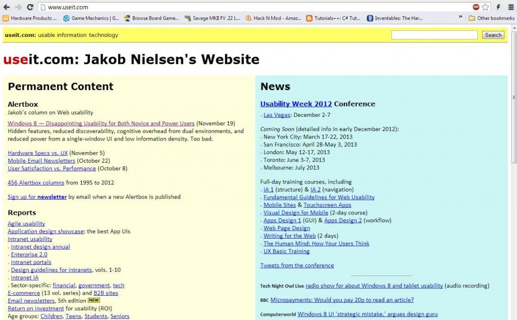
thing that got to me was his love of http://useit.com. When you visit a usability website and it
looks like the following, it has definite negative goodwill. I couldn’t stand being there for more than 45
seconds or so when I couldn’t find an article he referenced. What is an “Alertbox” on that site, anyway?
To Jakob
Nielsen’s credit, useit.com is definitely no-fluff.
Final Thoughts
Overall, I
appreciated reading this book. I felt
like it was a generally good refresher.
Next time when you leave a site, think about why. What was it that finally used up the last of
your goodwill? Based on the description
of Steve Krug’s second book, Rocket Surgery Made Easy”, I’m excited to dive
into it. I think it may be more
applicable to the QA space.


No comments:
Post a Comment